Le Triomphe. Magnifique.
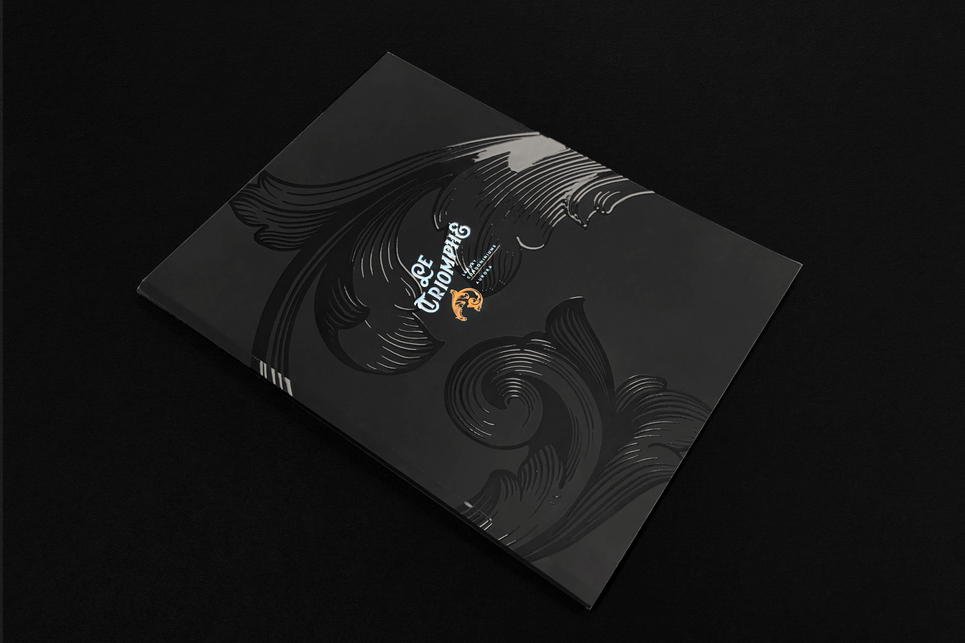
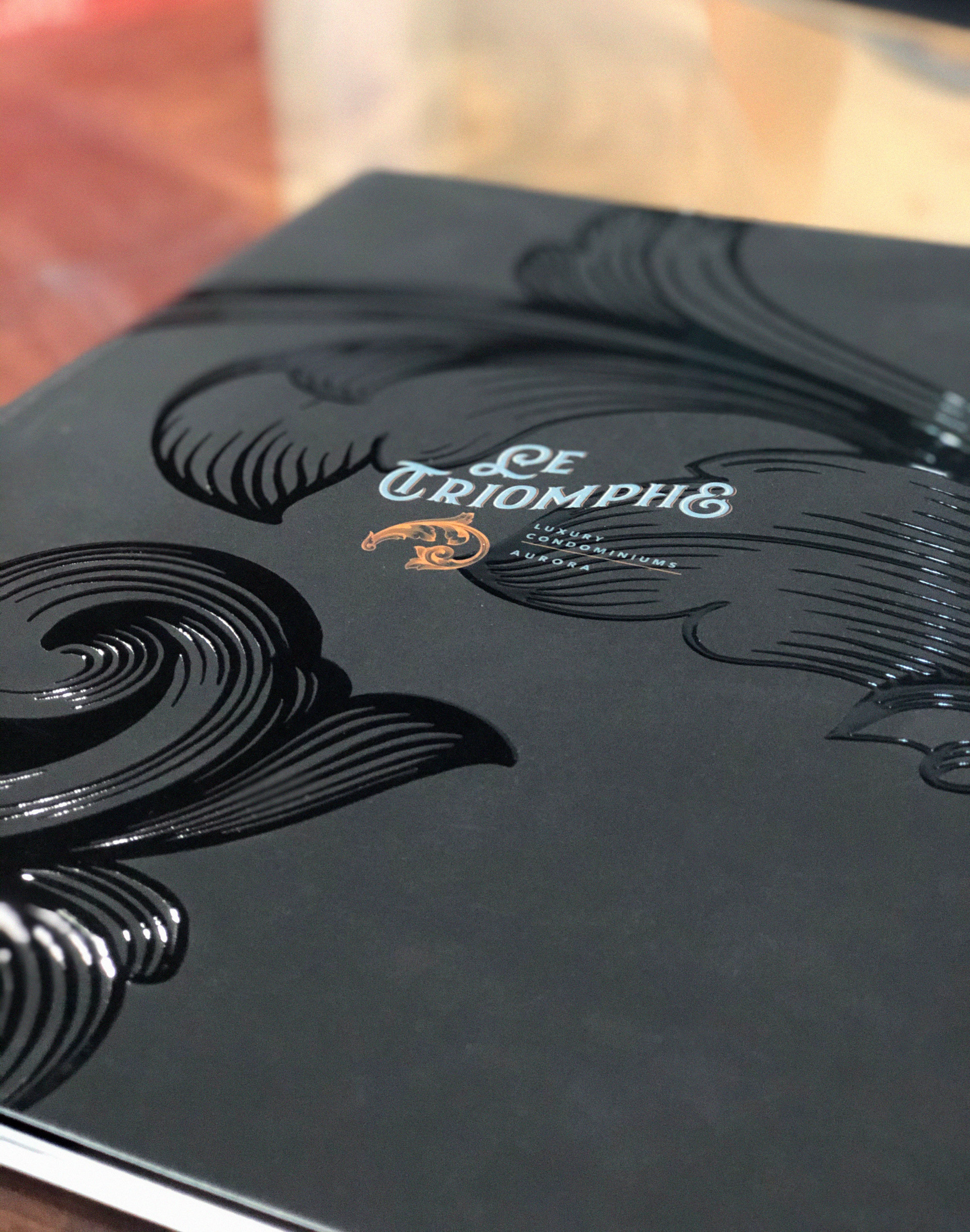
Le Triomphe is an upmarket condominium in Aurora, ON. Inspired by the building’s French-classical architecture, the name and logo capitalize on perceived French distinguished personality, sophistication and style. Borrowing from the immortal Fleur-de-lys, with touches of the Art Nouveau movement, this asymmetrical and artistic composition symbolizes and expresses prestige and elegance.
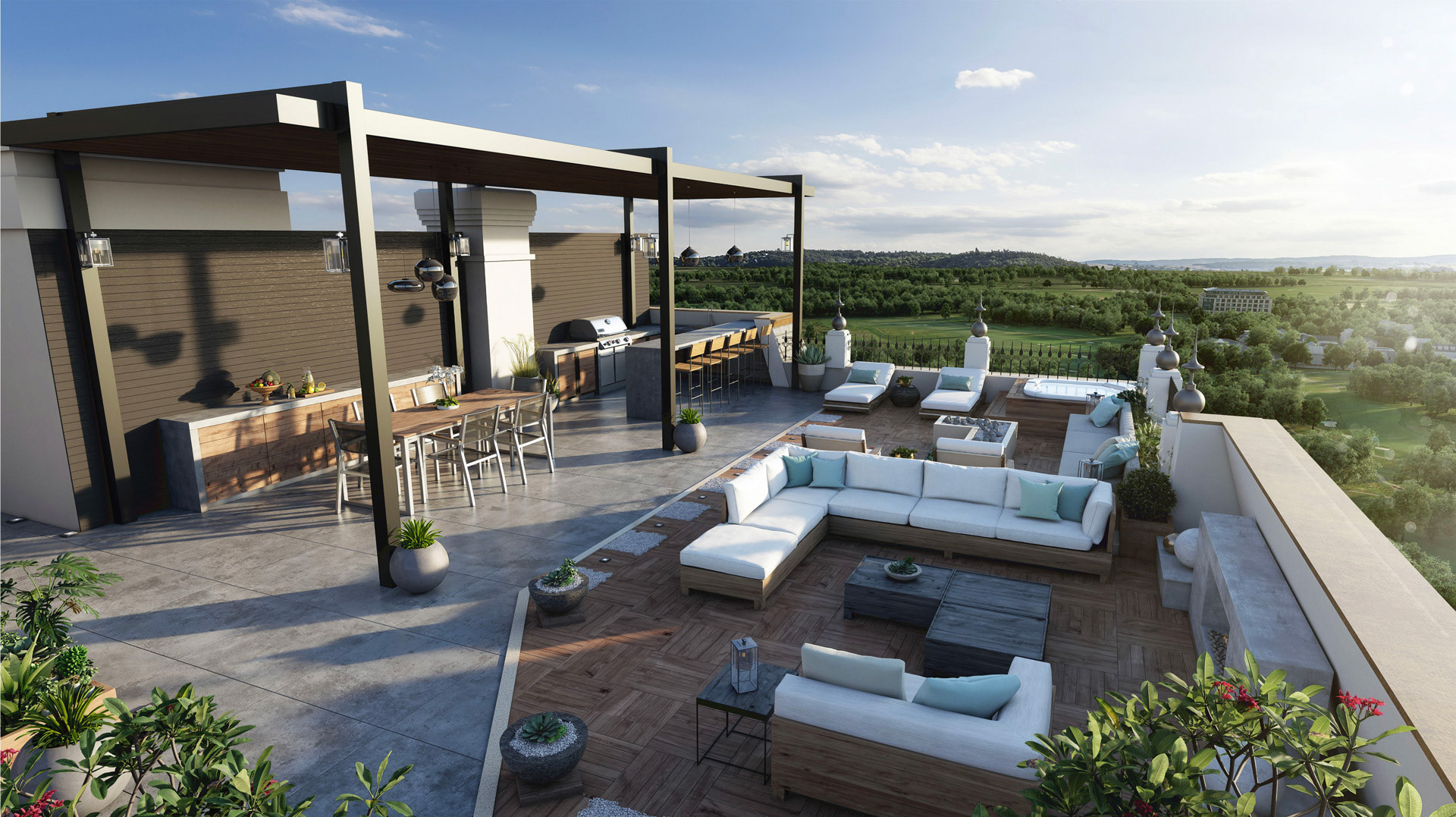
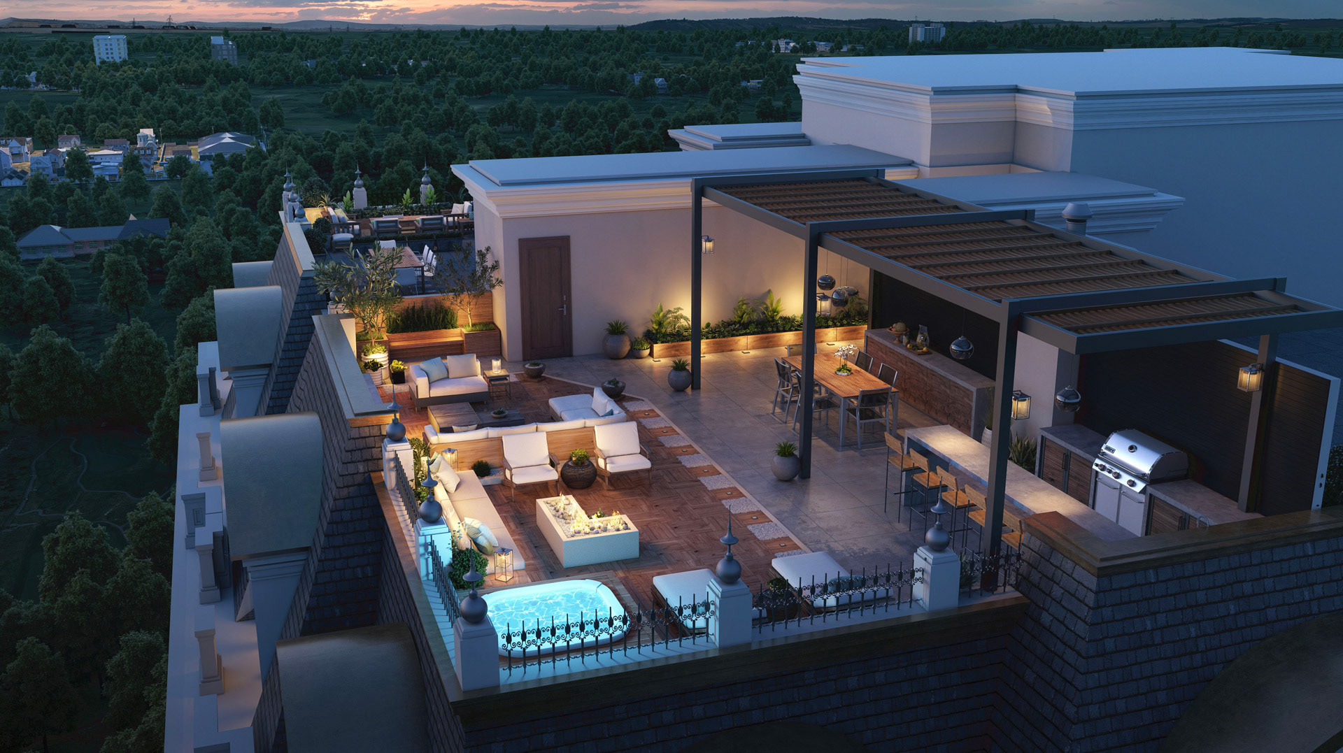
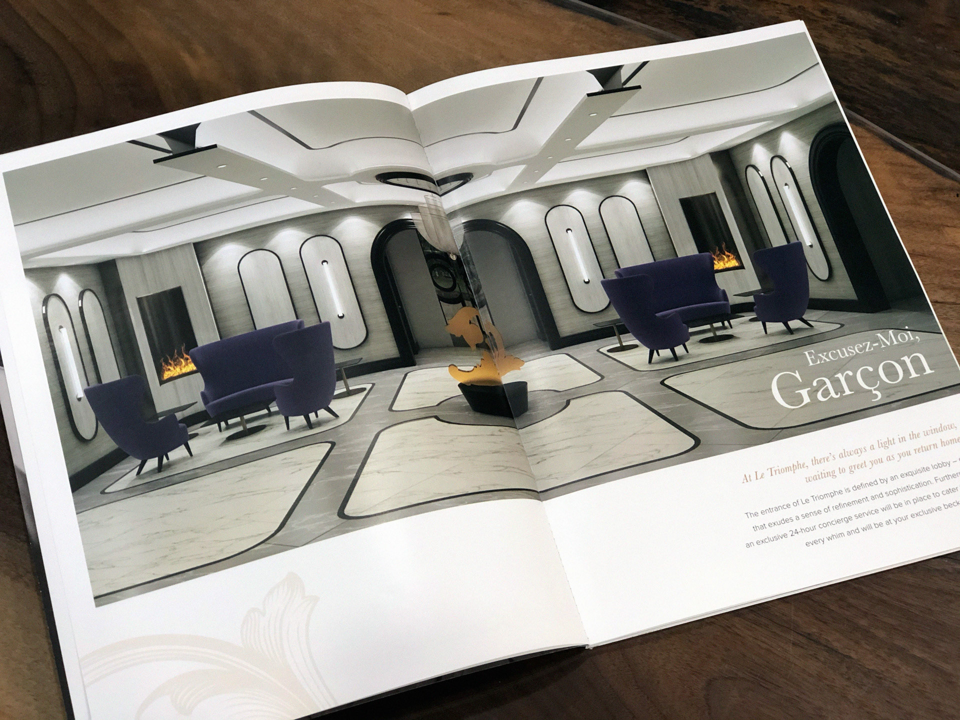
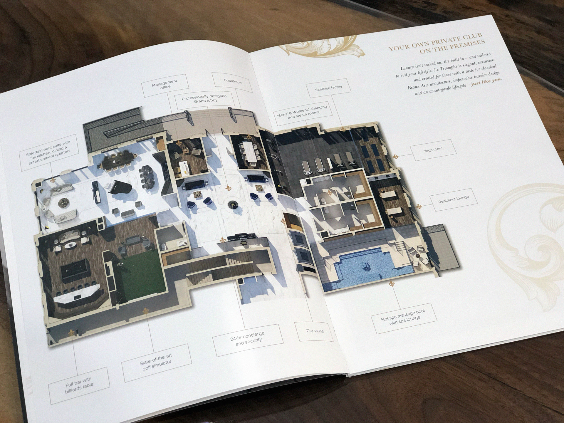
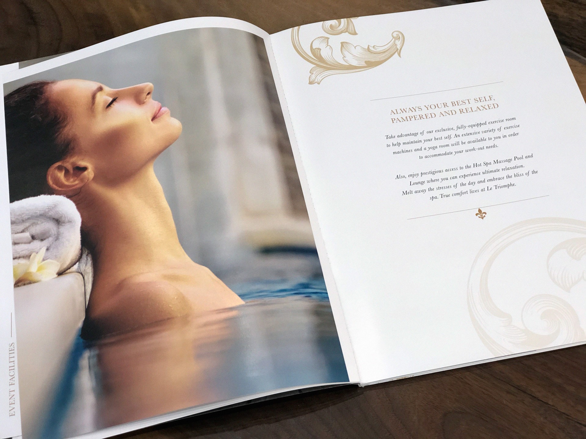
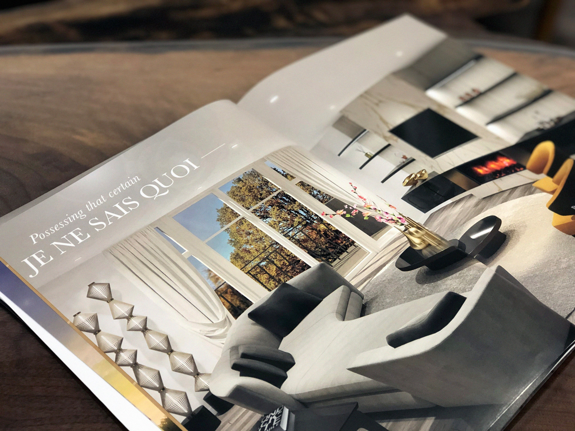
Accordingly, the brochure is a heavy stock, glossy publication with a sophisticated black and copper cover and luxuriously varnished ornaments on a matte background. Interior spreads feature large colour pictures with french-flavoured copy that tour the interiors, amenities, floor plans and features and finishes.
The website is a scrolling pictorial essay on the luxurious and sophisticated lifestyle, with extra-large pictures, elegant Parallax scrolling, short pointed copy and simple, shallow navigation that allows the reader to learn all with just a few clicks while creating a sophisticated first impression.
AGENCY: NGEN
CLIENT: Parcel Developments
YEAR: 2019
CREATIVE DIRECTOR: Victor Schmidlin
ART DIRECTION: Roopesh Kaduvettyil
WEB DESIGN: Laura Miller
COPYWRITERS: David Wray, Joseph Suskin
CLIENT: Parcel Developments
YEAR: 2019
CREATIVE DIRECTOR: Victor Schmidlin
ART DIRECTION: Roopesh Kaduvettyil
WEB DESIGN: Laura Miller
COPYWRITERS: David Wray, Joseph Suskin
